
About
The Responsive Iframe block is designed to help you embed third-party content from other websites or services. They can be used to add interactive maps, graphs, charts or videos to your page.
We encourage users to use the available Gutenberg blocks where possible, but know that sometimes there is a need for functionality that exists outside the theme.
You can hear more advice on how to work with embeddable content in our training materials.
Adding a Responsive Iframe block
To add a Section, click on the Block Inserter (+). Alternatively, you can type /Section in a new paragraph and press enter.
Get detailed instructions on adding blocks.
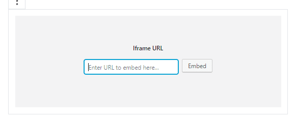
Once the block is added, a grey box with a text field will appear in the editor. Copy and paste the URL of the third-party asset that you would like to embed into the page. Click Embed.
Note: Consider the dimensions of the asset you are embedding when designing the layout of your page. For example, you should not iframe an infographic with text elements into a very narrow column, since the iframe would then be too small to read the text.
Responsive Iframe settings
You can adjust the size and dimensions of the iframe by using the block settings.
You can set Fixed or Responsive dimensions by using the fields in the block settings. If you want to use fixed dimensions, fill in the Width and Height fields. If you want to use Responsive dimensions, fill in the Minimum Height field (we recommend starting with 650 and adjusting it up or down as needed from there). The method you use will be determined by the iframe you’re embedding and the layout of your page. If you aren’t sure if you should use Fixed or Responsive, try both and choose which one looks best.
Fixed dimensions means that the iframe will always have the same height and width no matter what size device the front-end user is using to view the page. The content might still be responsive, but the frame on the page which houses that content stays the same. This means that some users might see a large gap on the page if the chosen dimensions are too big. Fixed dimensions are likely to be more appropriate for more complex iframes.
Responsive dimensions, which are the more user-friendly solution, will change the dimensions based on the size of the user’s device. It gives you less control over how the responsiveness of your iframe works, aside from designating a minimum height so that the iframed content isn’t cut off. The size of the frame that houses your iframed content shifts based on the size of the users device.
Responsive Iframe Demonstration
Fixed dimensions
(this is the bottom of the iframe. This is because the designated height was too large for the content in the iframe)