
About
The Slider block is designed to present a series of images or slides which users can browse by clicking arrows on the left and right sides of the block. The slides can include some text, but should be mostly used to present images.
Adding a Slider Block
To add a Slider, click on the Block Inserter (+). Alternatively, you can type /Slider in a new paragraph and press enter.
Get detailed instructions on adding blocks.
Click the ‘Add Slide’ button to create your first slide.
Select an image for your Slide by going to the Block settings and click ‘Set image’ under the title ‘Slide Background. This will open the Media Library where you can select from already uploaded images or upload a new image. Note: The dimensions of the slider block are responsive, meaning they will appear wide on a desktop screen and narrow on a mobile. Consider this when choosing images for your Slider. Do not forget to add image credits and alt text to all images in your slider.
Create more slides by clicking ‘Add Slide’ at the bottom of the block.
There are two ways to add text to your slider. You can add it to the title box or you can add it as a caption which will display along the bottom of your slide.
You can add text to the title box by typing into the editor. Note: You don’t have to use each of the provided fields in your title block. If you leave that content empty, it will not show up on the live version of the page. However, you will still see text in parenthesis in the editor in case you want to go back and add something in later.
See the example below to view the two ways you can add text to a slide.
Slider Block Settings
Each block has its own block-specific controls that allow you to manipulate the block in the editor. Click on the block you want to edit and select the settings wheel in the top-right corner. Make sure you have selected the Block tab in the settings sidebar.
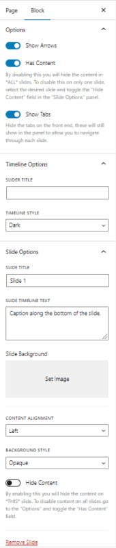
Options
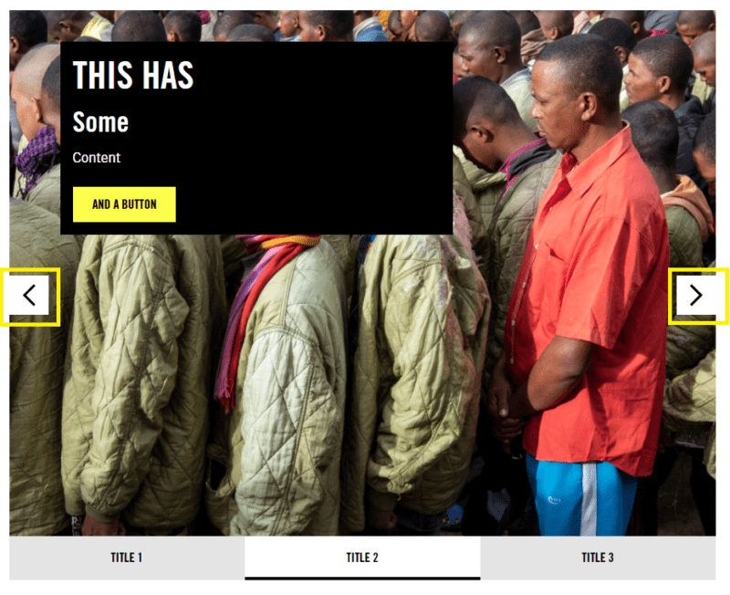
Show Arrows
Your Slider block will have arrows on the left and right side of the block added by default. You can turn these off by switching the ‘Show Arrows’ toggle in the block settings.
Note: The only way to navigate between slides is either the arrows or the tabs. Make sure you have at least one of these options turned on.
Has content
The content box is the black box that is presented on top of the image in your slide. This content box will be added by default, but you can remove it by clicking the ‘Has Content’ toggle.

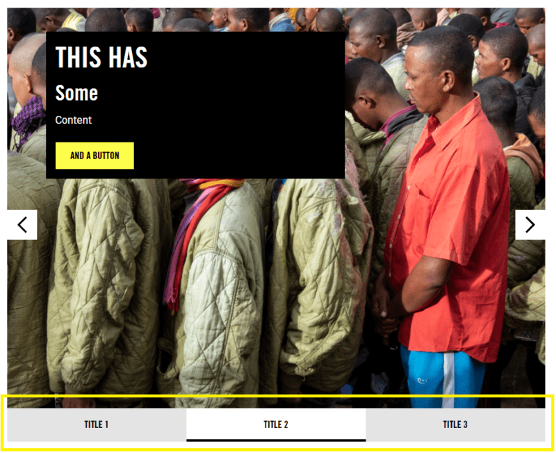
Show tabs
The bottom of the Slider Block has a list of tabs which you can use
Timeline Options
These options apply to all slides in your slider.
Slider Title
The Slider Title is the name of your slider, and shows up at the top of every slide. We recommend keeping this text short, since there is a limited amount of horizontal space.
is the text that is used to label the slide in the tabs at the bottom of the block. We recommend keeping this text short, since there is a limited amount of horizontal space.
Timeline Style
The Timeline style changes the colour of the background behind the caption text. You can choose Dark, which is a dark grey background, or Light, which is a light grey background.
Slider Option
These options only apply to the current slide.
Slide Title
The Slide title is the text used to label the slide in the tabs at the bottom of the block. We recommend keeping this text short, since there is a limited amount of horizontal space.
Slide Timeline text
If you decide to add text to your slider by using the caption style, then you can add your captions to the Slide Timeline Text.
Content Alignment
The Content Alignment drop-down menu lets you choose where the content, or title box, appears on the slide. You can have it on the left, centred or on the right.
Background Style
You can add a background style to the images in your slider to make it easier to read the text. Sometimes the colours in an image can make it difficult to read text that is overlayed on top, which is what makes this an important feature. You can select Opaque, Translucent or Transparent.
Slider Block Demonstration
This Slider has Arrows and Tabs
This Slider has Arrows and No Tabs
This Slider has Tabs and No Arrows.
This Slider has Tabs, Arrows but No Content.
This Slider has Tabs, Arrows, Slide Timeline Text, No Content and a Slider Title. It uses the Dark Timeline Style
This Slider has Tabs, Arrows, Slide Timeline Text, No Content and a Slider Title. It uses the Light Timeline Style
This Slider has Left-aligned content
This Slider has Center-aligned Content
This Slider has Right-aligned Content
This Slider has Opaque Background Style
This Slider has Translucent Background Style
This Slider has Transparent Background Style