About
The Custom Card Block lets you create a ‘card’ that signposts users to another page. Unlike the Post List block, you can customize all of the fields on a Custom Card block. This can be helpful if the page you are linking to has a long title that doesn’t fit well in the signpost or if you want to add additional labels.
Adding a Custom Card Block
To add a Section, click on the Block Inserter (+). Alternatively, you can type /Section in a new paragraph and press enter.
Get detailed instructions on adding blocks.
An empty card will appear in the editor, with placeholder text for the Label, Content and Button text. Click these fields to fill them with your own text. You can leave fields blank if you don’t want to use them.
Click the picture icon in the top right corner to select your image from the Media or upload a new image.
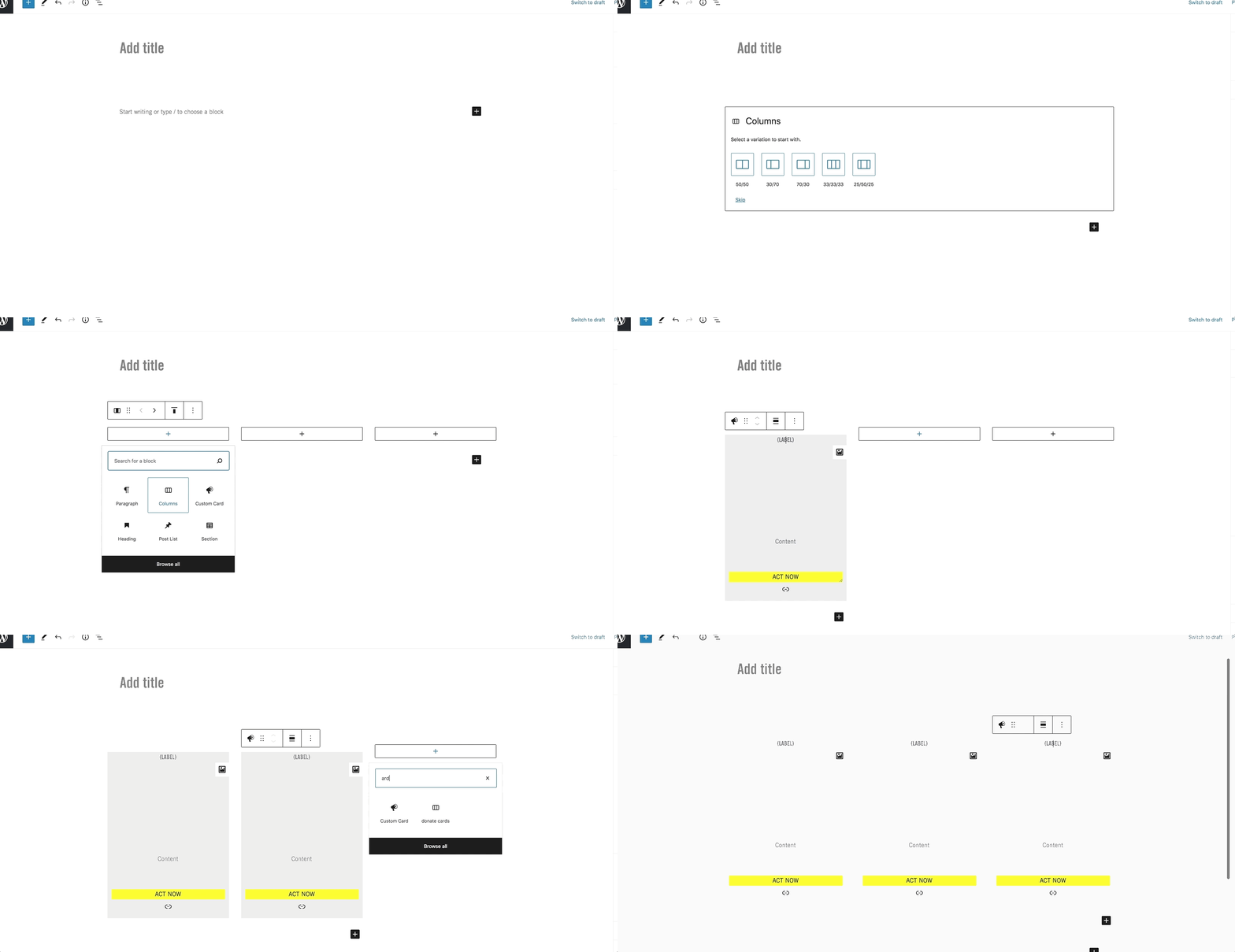
Note: If you want to insert multiple cards side-by-side, you can do so by inserting the Column Builder and adding the Custom Card to each column as shown below:

Custom Card Block Settings
Styles
You can choose from three styles: light grey, dark grey or yellow. See the demonstration below for examples.
Size
You can choose between a Standard block and a Wide Block. This setting impacts the dimensions of the image part of the card. See the demonstration below for examples.
Custom Card Block
This Custom Block uses Style 1

Content goes here, lots of content for you to add into this area!
Button TextThis Custom Block uses Style 2

Content goes here, lots of content for you to add into this area!
Button TextThis Custom Block uses Style 3

Content goes here, lots of content for you to add into this area!
Button TextThis Custom Block is a Standard Size

Content goes here, lots of content for you to add into this area!
Button TextThis Custom Block is a Wide Size

Content goes here, lots of content for you to add into this area!
Button Text
