
About
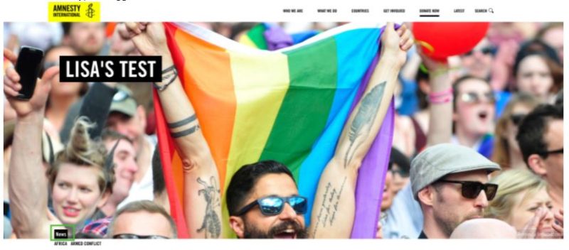
The Header block creates a visual banner at the top of your page, with options for a Heading, Subheading and a Call to Action button. This block is usually the first inserted into a page when using the Component Template and always shows at the top of the page.
This block can also be used with the donate block to add a donation form to the top of a page.
Adding a Header Block
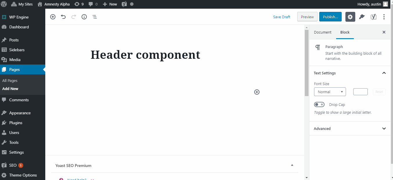
To add a Header, click on the Block Inserter (+). Alternatively, you can type /Header in a new paragraph and press enter.
Header Block Settings
Alignment
This changes the alignment of the Title, Subtitle and Call to Action button within the header. There are three options:
- Left
- Centre
- Right
Background Colour
This allows you to change the background colour of the Title, Subtitle and Call to Action button. There are four options:
- Translucent black
- None
- White
- Black
Size
This changes the depth of the Header block. Using the smaller Header block is a good way to reduce the amount of scrolling a user needs to do before they arrive at the rest of the content. There are two size options:
- Normal
- Small
Background Type
You can choose to either show an image or a video in the background of your Header.
N.B. using a video in the Header background can significantly increase page load time. If you do decide to add a video to the Header, you should ensure the file size is not too large.
Once you have selected the background type, then use the ‘Featured Image’ tool to add your background media. If you are using a video, you will also need to add a fall back image. The background video will auto play when the page is opened.
Embed url
This enables you to add a video play button to the Header. Add a link in the embed url field to the YouTube video you want to use. The Call to Action button will then have a ‘play’ symbol and when clicked, the YouTube will pop-up in a modal window.
e.g.:
Featured Image
Use the Featured Image selector to add your Header background image or video. Click Select Featured Image and either choose from the Media Library or upload your media.
Donation Form
You can also add a Donate block to sit within the Header block. when you insert the Header block, you will see a ‘+’ button appear, click this and a Donate block will appear within your header.
Header Block Demonstration
You can see an example of how the Header Block looks at the top of this page.
Taxonomy tags
When taxonomies are assigned to a page they are displayed at the bottom of the Header block. Content Type should be the primary taxonomy, if more than one taxonomy is being used.