About
The Links with Icons block can be used to display several calls to action or options that your user can choose to click on. This block is also a great way to highlight facts and statistics. There are a variety of block settings you can use to adapt the block for your content.
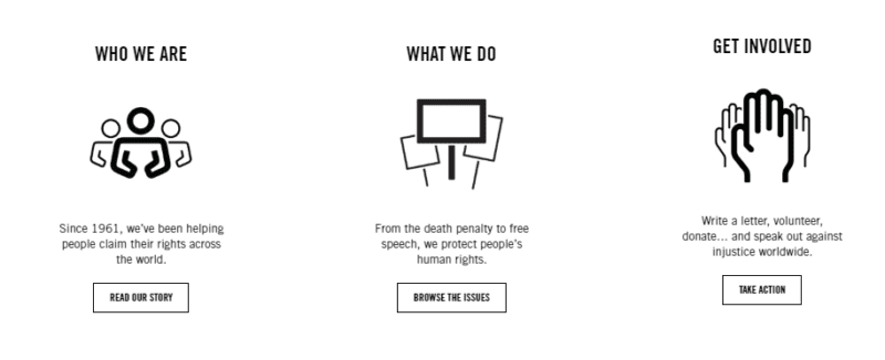
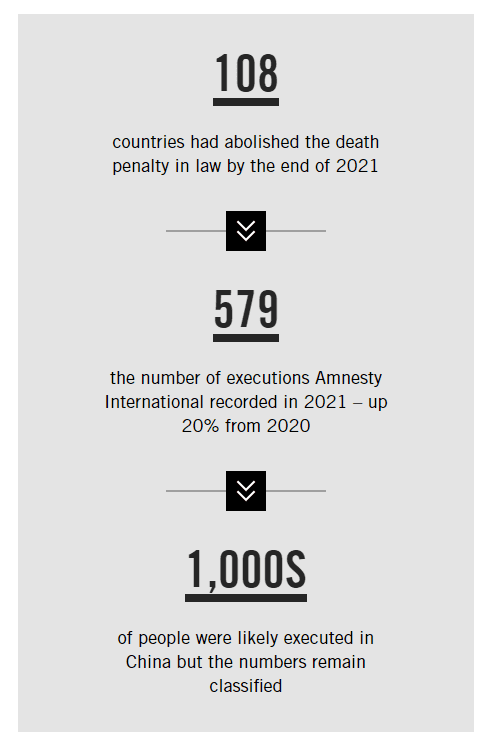
Adding a Links with Icons Block
To add a Links with Icons Block, click on the Block Inserter (+). Alternatively, you can type /Links with Icons in a new paragraph and press enter.
Links with Icons Group Block Settings
The Links with Icons Block is a group block. There are some settings that you can adjust to change the styling for the whole group and some that you adjust in each block individually.
Styles
There are two styles to choose from, default and square:
Default Style

Square Style

Quantity
This allows you to select the number of items you want in your group. The minimum is 1 and the maximum is 24.
Orientation
You can choose to align your Links with Icons block horizontally or vertically. Horizontal Links with Icons blocks will be arranged in rows and vertical Links with Icons blocks will be arranged in a single column.
Background Colour
The Links with Icons Block can have either no background or a grey background.
Hide Lines
By default, the Links with Icons block has a line in between each item. These can be hidden by switching the Hide Lines setting on.
Divider Style
The divider style can also be changed to one of three styles:
- None
- Arrow
- Ampersand
Links with Icons individual block Settings
Style
This setting selects the type of content you will use in the middle of the Link with Icon. There are three options:
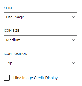
1. Use image – this is mostly used with icons. Once selected, you will be able to add an image, change the icon size, switch the position of the icon and hide the image credit.
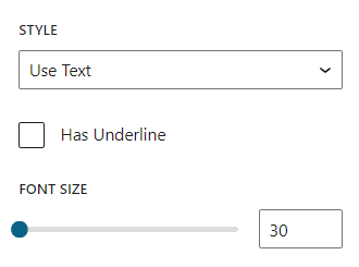
2. Use text – mostly used showcase facts and statistics. Once selected, you will be able to add an underline and adjust the font size.
3. Plain – this removes the image/text.

Display Action
By default, each Link with Icon will have a button. However, you can choose to remove the button, by de-selecting the display action check box.
Button Style
You can choose from one of the standard three button styles:
- Primary (Yellow)
- Dark
- Light

Links with Icons Block Demonstration
Some various Links with Icons Block configurations are shown below:
Title
Body text
Title
Body text
Title 1

Sub text 1
Title 2

Sub test 2
Title 3

Sub text 3
Title
Body text

